
Welcome to Plus.One.Up

We are creative professionals who help businesses grow through compelling brand identities and strategic marketing campaigns that deliver measurable results.

As you explore our portfolio, you'll see our commitment to innovation and the impact we've created for clients across diverse industries.

Thank you for considering Plus.One.Up as your creative partner.

Ready to elevate your brand? Let's create something extraordinary together.
© 2025 All Rights Reserved
Powered By Plus.One.Up.

Welcome to our Portfolio! At Plus.One.Up We are a Team of Creative Experienced Professionals who are dedicated to helping Businesses like yours reach their full Potential, grow and take a Big Step. From Developing Powerful Brand Identities to Executing targeted Marketing Strategies and Campaigns, we have the skills and Expertise to Drive Real Results. As you Explore our Portfolio, we Hope you get a Sense of our Passion for what we do and what we done in some of our past Projects and learn more about how we can Help your Business Stand out in a Crowded Market. Thank you for Taking the Time. We Hope you Enjoy Learning More About our Works We are Passionate about the Opportunity to Work Together and Help your Business Reach its full Potential.[email protected]
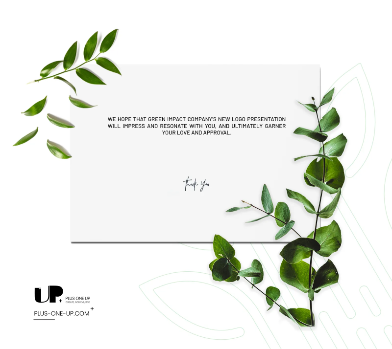
A refined thank-you design by Plus One Up wraps up Green Impact’s brand presentation with a visual style that mirrors the company’s identity. The clean white card features a centered thank-you message in English, framed by natural green foliage on both sides, seamlessly tying the design to the company’s environmental theme. The composition conveys warmth, gratitude, and a lasting positive impression. Design Objectives: Conclude the presentation with a visually strong and professional message. Connect the closing note to the company’s environmental brand identity. Highlight attention to detail and visual appeal even in final touches. Key Visual Elements: Minimal white card for clear text presentation. Natural botanical elements to add vibrancy and nature linkage. Elegant typography for the thank-you note, blending professionalism with friendliness. Harmonized color palette combining natural green with white for contrast. This work was executed by Plus One Up to showcase the company’s ability to merge aesthetics and simplicity, even in the smallest design details.Read More
تصميم شكر أنيق من Plus One Up يختتم عرض هوية Green Impact بأسلوب بصري يعكس روح العلامة التجارية. البطاقة البيضاء البسيطة تتوسطها عبارة شكر بالإنجليزية، محاطة بعناصر نباتية طبيعية على الجانبين، ما يربط التصميم مباشرة بالهوية البيئية للشركة. هذا التنسيق يبعث إحساسًا بالترحيب والامتنان، ويعزز الانطباع الإيجابي لدى العميل. أهداف التصميم: إنهاء العرض بأسلوب بصري يترك انطباعًا قويًا واحترافيًا. ربط الرسالة الختامية بالهوية البيئية للشركة. إبراز الاهتمام بالتفاصيل والجاذبية البصرية حتى في الرسائل الختامية. أبرز عناصر التصميم: بطاقة بيضاء بسيطة تبرز النص بوضوح. عناصر نباتية طبيعية تضيف لمسة حيوية وتربط التصميم بالطبيعة. خط أنيق لكتابة عبارة الشكر بما يعكس الاحترافية والود. تناسق الألوان بين الأخضر النباتي والخلفية البيضاء لإبراز المحتوى. تم تنفيذ هذا العمل في Plus One Up ليعكس قدرة الشركة على الدمج بين الجمالية والبساطة في جميع مراحل التصميم، حتى في التفاصيل الختامية.Read More
Brand : Green Impact / Branding
Date Added : 2024-09-23